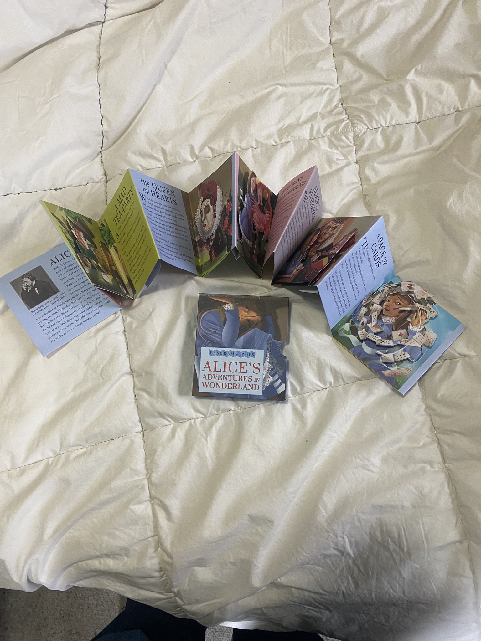
Pop-up treatments of Alice in Wonderland
Let's compare some various approaches.
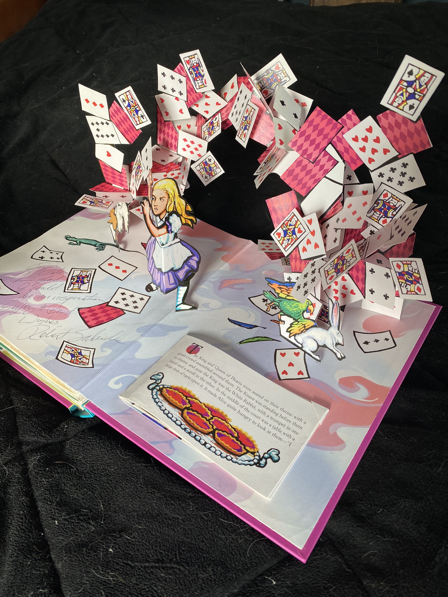
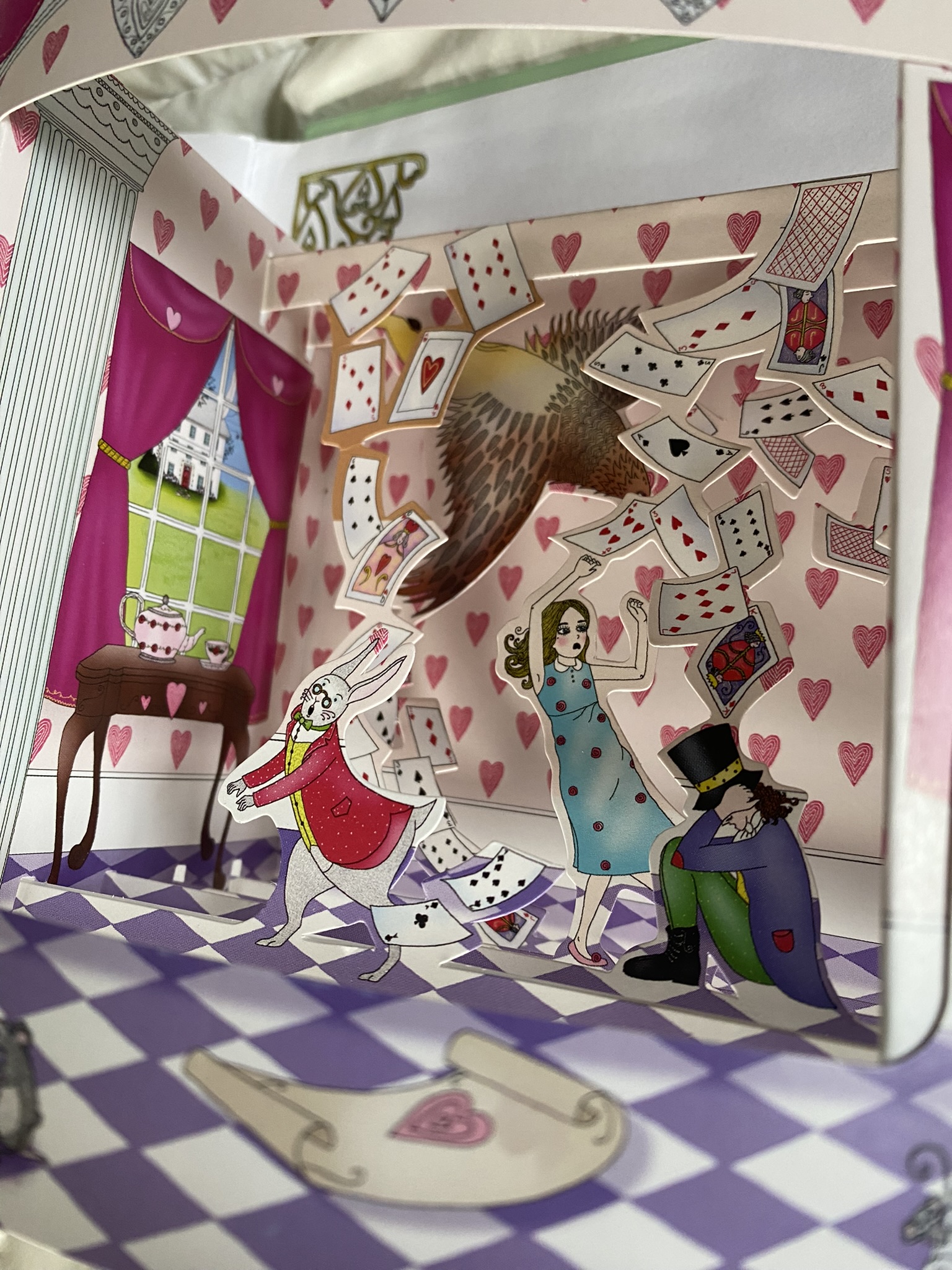
There are a lot of pop-up books that are based on Alice in Wonderland. The image above is one of my favorites.
The complexity of the cards in the air, and the way they all fold down without jamming when the book is closed still
kind of blows my mind. This was the image that got me interested in making pop-up cards, and if you look
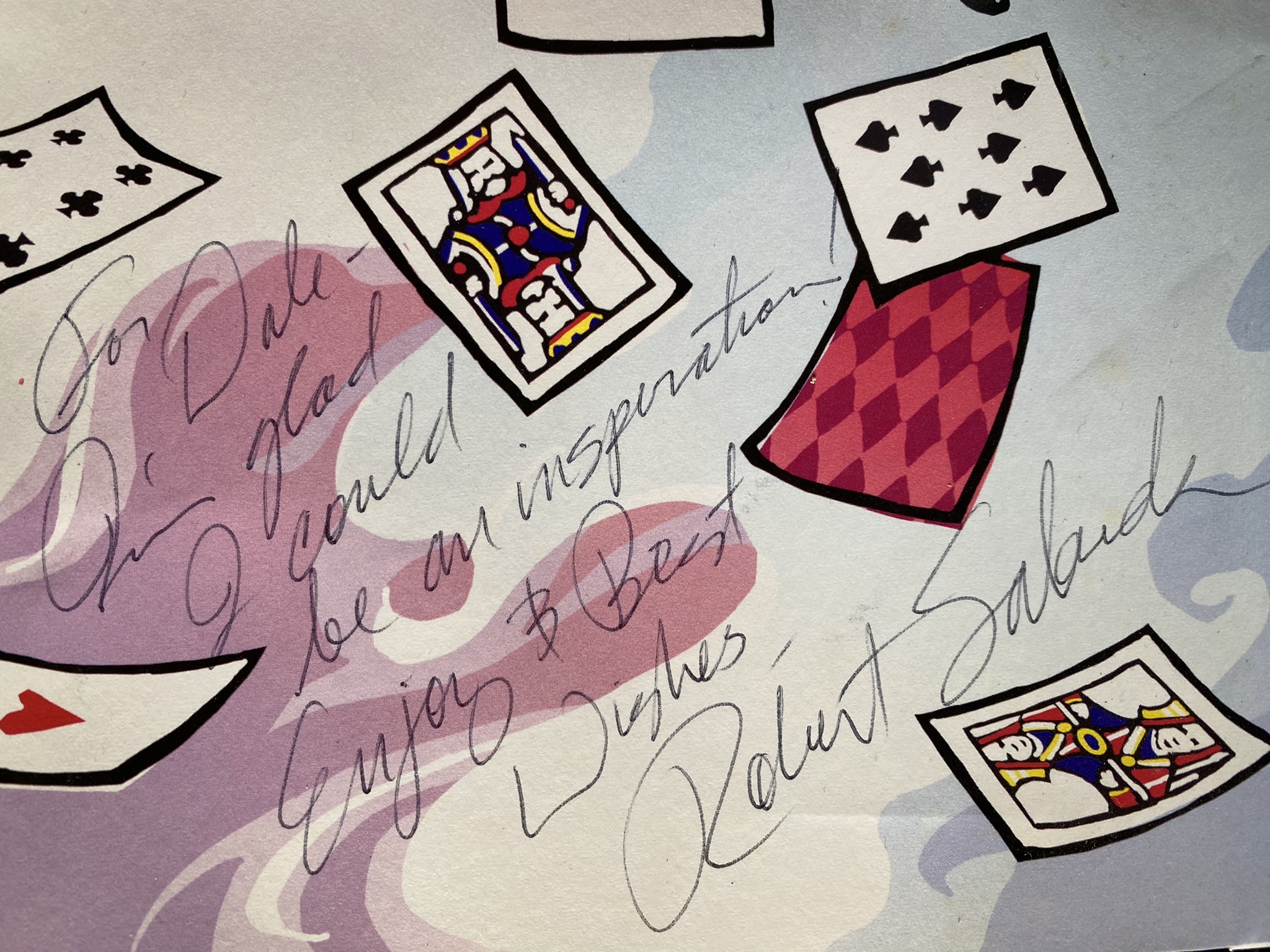
closely at the second image above, you can see that I got the paper engineer, Robert Sabuda, to sign this page for me.
(pictures from Alice's Adventures in Wonderland - Robert Sabuda)
So lets take a look at some
of the other ways pop-up books treat the same scene from their versions of Alice...
This scene is from a 'pull-tab' pop-up, where you pull out tabs on
both sides of the scene, and it opens up like opening the curtain on a theater stage. You can see the cards swirling above Alice,
the White Rabbit, and the Mad Hatter. The picture doesn't capture the depth of the swirling cards, and all in all I think this is a
pretty cool Alice. I appreciate the unusual format, too (pull-tab pop-up).
(picture from Alice in Wonderland - With Three Dimensional Pop-Up Scenes - Maria Taylor)
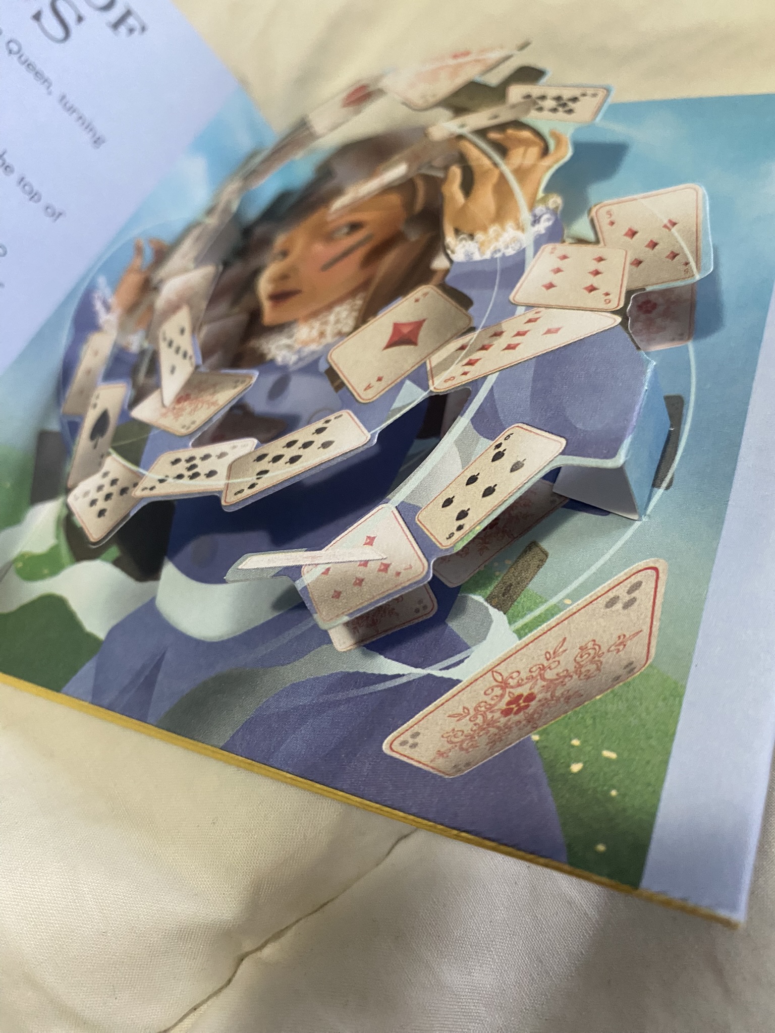
This is a panorama book - which basically means it is a fan-fold book (that comes in a
separate box type cover). As you unfold the book, each one of the folded pages typically contains a pop-up, and the fan-fold is printed on both sides.
In this particular book the pop-ups are very low relief, that is, they hardly pop at all.
(picture from Alice's Adventures in Wonderland, illustrations by Grahame Baker-Smith, and paper engineering by Richard Ferguson)
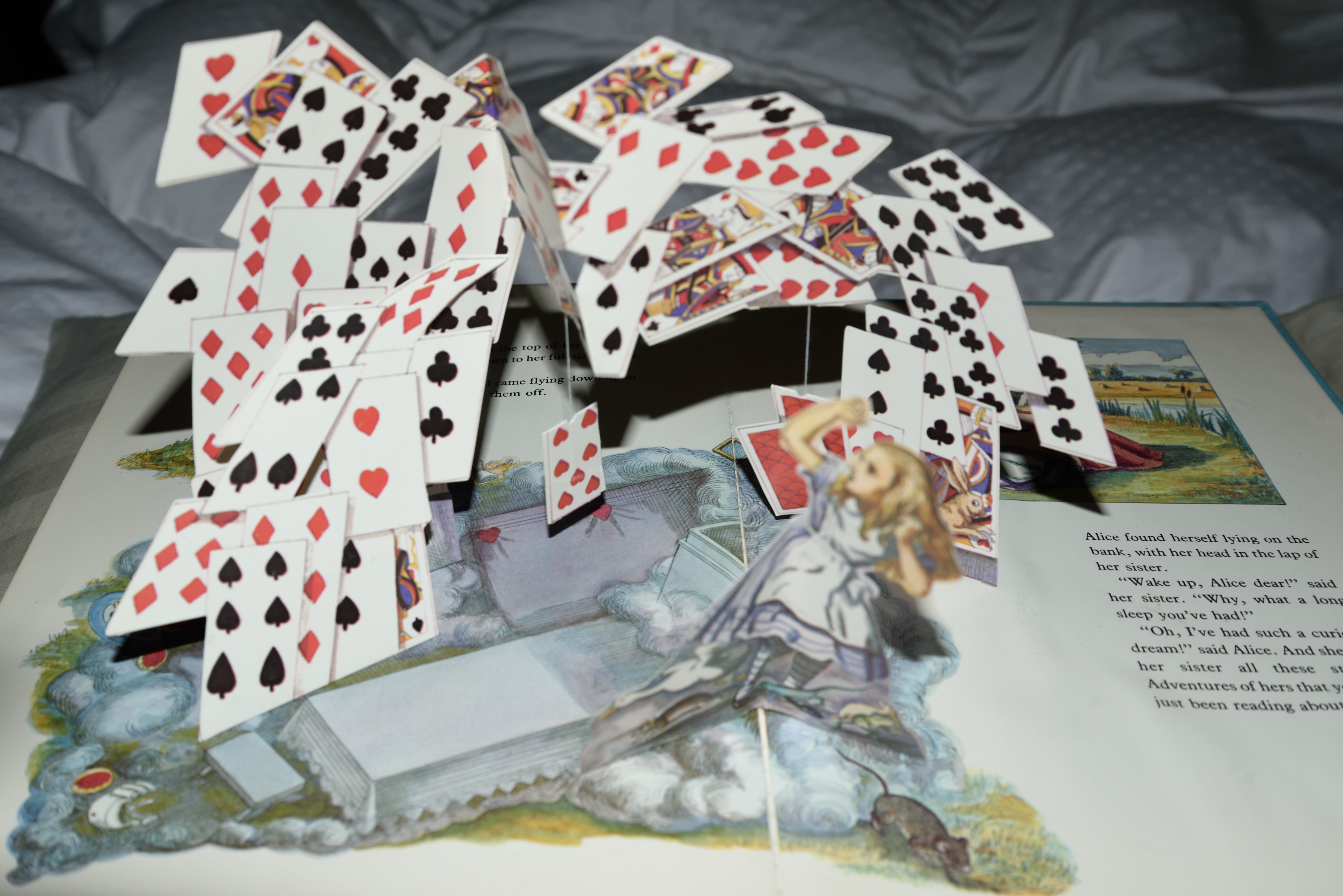
This one is kind of cool, it has an arch of cards in the air over Alice, and adds in a few cards hanging by strings
so that when you open the page there is motion in the swinging cards. I am sure this was an influence on the Sabuda book as it was
being planned.
(picture from Alice's Adventures in Wonderland - A Pop-Up Book - Jenny Thorne - after John Tenniel)
This is the typical preschool pop-up book that I had as a kid. The pop-ups are very
simple and non-threatening. But as I look closer at it the Queen of Hearts does sentence Alice
to have her head chopped off. I wonder how many other of these 'preschool pop-ups' mention
death, bodily harm, etc? I guess Grimm's Fairy Tales were pretty gruesome. At any rate, the reatment of
the cards flying all around is very simple.
(picture from A Favorite Pop-up Book - Alice in Wonderland - Derrydale Books)
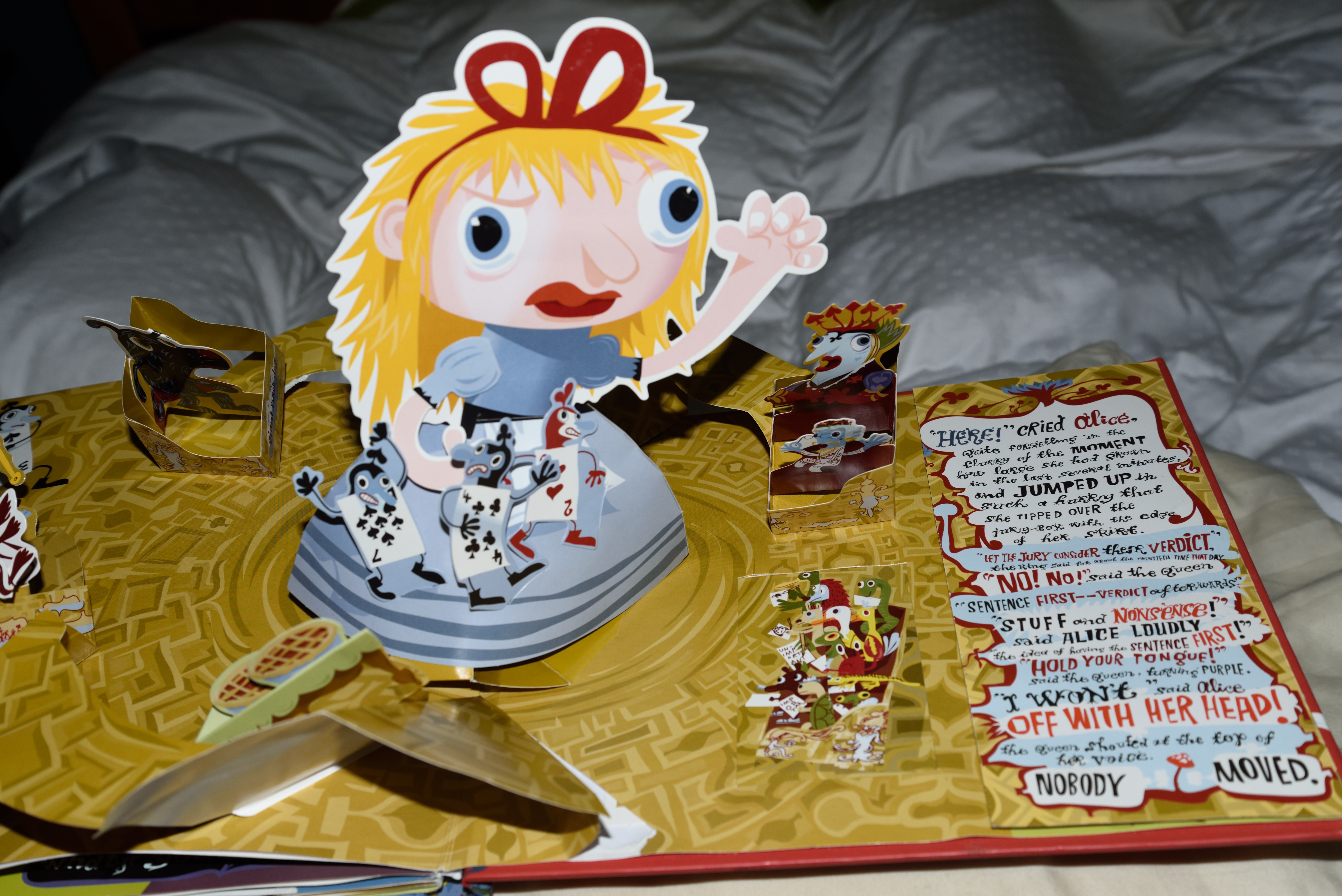
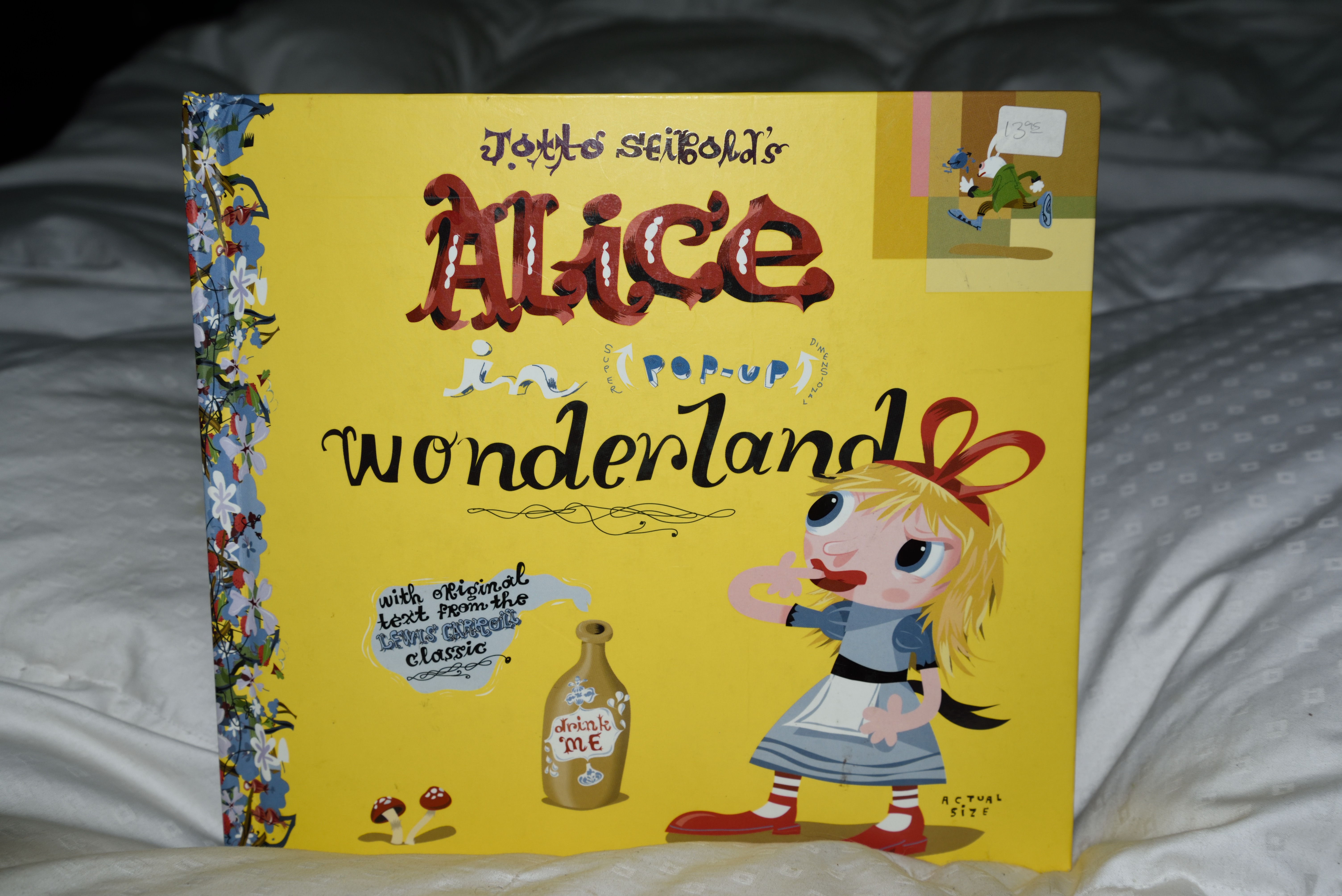
And finally we have the book by Jotto Seibold. Whereas the other books concern themselves with paper
engineering techniques to get the cards in the air above Alice, Seibold is all about the visual design. His book is
Alice on acid - each page is stacked with details and text and crazy fonts. But as for the cards, well, Alice has three
card-soldiers stuck to her, and they barely pop out at all. But Alice is a strong vertical pop-up, with her fist
raised to the Queen. I like this one, buts its definitely a different approach.
(picture from Alice in Pop-Up Wonderland - Jotto Seibold)
These examples raise the main question of pop-up books: technique vs artistry. Most of the examples
show techniques that are tour de force - intricate folds, multiple hinges, angled cards linked to each other,
cards hanging from strings. Not to say they
do not show visual mastery, but the emphasis (to me at least) is technical. Probably my favorite pop-up artist is
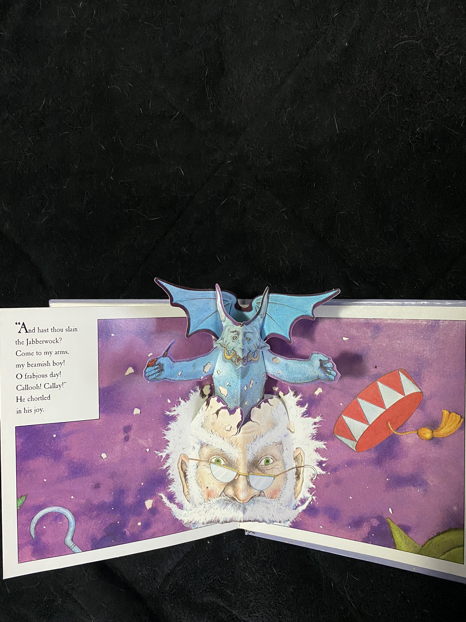
Nick Bantock, who makes small format pop-up books that illustrate existing stories or poems (Jabberwocky, the Walrus and the Carpenter,
Kubla Khan, Robin Hood, etc). His pop-up mechanisms are simple, usually centered on the main fold of a page where
there is the greatest mechanical advantage,
and the pop-up action comes from a single, simple fold (see example below). But I really like his imagining of the scenes in his books. I feel
his books are prime examples of artistry over technique.
(picture below from Jabberwocky - Nick Bantock)